

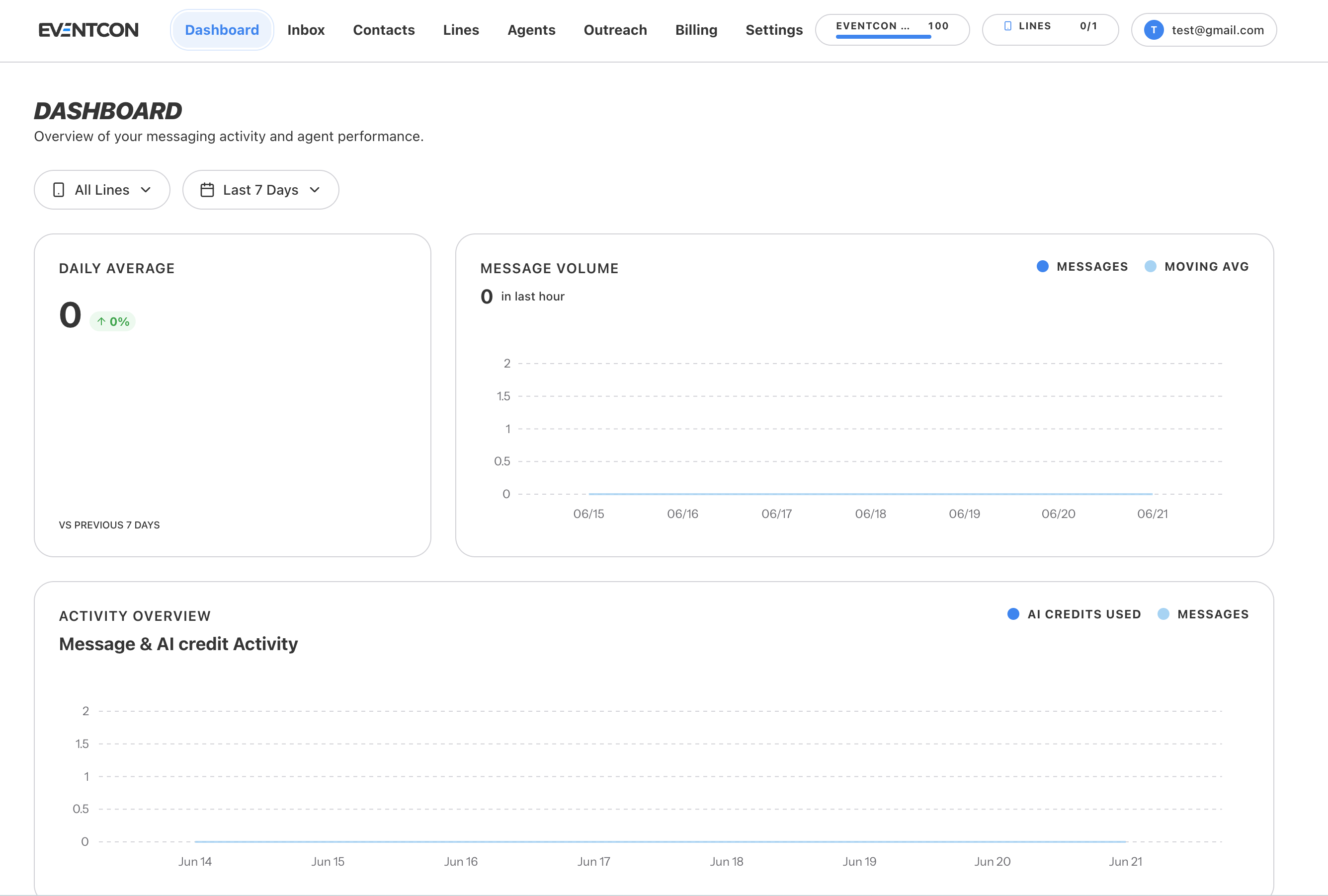
Filters
Two filters at the top control every chart on the page:- Lines: show All Lines or a single line. Use this to compare lines, such as an Inbound line running ads against a Two-Way line running outreach.
- Date range: for example Last 7 Days. Comparisons on the page use a previous period of the same length.
Cards
Daily Average
Daily Average
The average number of messages per day in the selected range. The colored badge shows the change against the previous period of the same length (for example, vs previous 7 days). Green means up, red means down.
Message Volume
Message Volume
Messages over time, plotted as Messages with a Moving Avg line to smooth out daily spikes. The number at the top shows messages in the last hour, which tells you quickly whether a campaign is sending right now.
Activity Overview
Activity Overview
Message & AI credit Activity plots AI credits used against Messages day by day. Use it to see how hard your agents are working and to predict when you’ll need more credits.
Using the dashboard well
- AI credits rising faster than messages? Your agents are holding longer conversations. That’s often a good sign, but check that they’re steering toward a booking or a sale and not chatting in circles.
- Daily average dropping? Your campaigns may have run their course. Plan your next outreach campaign or a reactivation push.
- Comparing lines? Filter to one line at a time to see which one your audience responds to best.